Fresh and Fearless
Case Study:
Service: Website in a Week
Platform: Squarespace
Website: freshandfearless.uk
Sara from Fresh and Fearless is a DEI powerhouse focused on creating cultures of belonging where people feel seen, heard and valued. With a background in student advocacy and inclusive PR and marketing alongside over 10 years of speaking experience, Sara funnelled all of her experience and passion into a variety of fresh, fun and engaging consultancy and workshop offerings. She also has a fantastic video podcast, Out of the Office, exploring episodes of the hit TV show The Office (US) with guests through the lens of DEI.
The Problem
There was far too much text on her existing website, meaning that it was unclear to potential clients exactly what Fresh and Fearless did and how - they had to wade through walls of text before learning about their offerings. These offerings were also for different types of clients and audiences, which didn’t translate well given the lack of hierarchy in the text and impacted conversions. Sara also wanted to host information that people could download from the website but had no idea how to achieve this, as well as regularly update the site with new podcast episodes.
Some key goals for the website:
Clearly explain what Sara's business is, does and who it helps
Showcase the many aspects of the business
Convert visitors into customers by making sure they have clear CTAs
Showcase the podcast and make it easy for Sara to keep the site updated
The client wanted:
A bold website that converts interest into welcome calls
Sara’s dream was to have a website that left clients feeling inspired, engaged, informed, motivated and energised to learn more about her business and its offerings, resulting in them booking her free consultation calls.
The Solution
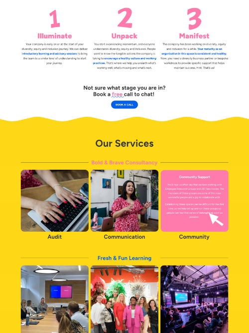
A brand new, 5-page website full of targeted information, bold colour and gorgeous custom graphics created by Laura at ZigZag, who Sara worked with previously. I made the homepage really clear and simple to explain what the business is, what services they offer (according to user types) and included key CTAs to lead the user to read more on the topic and service of their interest. For areas heavy with info, I made the text hidden that shows on hover, to ensure the content doesn’t feel too overwhelming. Each page follows a flow that leads the user to engage or enquire, and I created a podcast page that was simple for Sara to update regularly.
Now Sara has a fresh website that:
Showcases all of the services she offers
Takes each user on a clear journey
Points potential clients to book a call
Includes downloadable resources
Is full of branded design
Is easy to update
“From the start of working with Hannah, it has been seamless and clear. I always knew what to expect and was given clear deadlines and timelines - which was super welcome as someone with ADHD! During the week, while working on the website, I was regularly updated with clear and direct information so that I could see how the website was shaping up. When I gave feedback on tweaks and edits, they were done effortlessly. I'm really impressed and very happy with the website. Thank you!”
Sara, Fresh and Fearless
Looking for a bold website that your customers will love?
let’s work together!
Bring clarity, conversions and an easy-to-update flow via a full website build with my Website in a Week service!


